Mercury
Design system.
The shared language for the Mercury website: colour, type, layout, controls, motion, imagery and the logo. Follow it so every new page looks like it belongs.
Principles
A short set of rules to follow before reaching for anything new.
- 01
Calm, clear, professional
Generous space, strong contrast and few things competing. Depth comes from tone and borders, not shadows.
- 02
Tokens, not values
Colours, type sizes and spacing come from tokens in app/globals.css. Never hard-code a hex or a font size in a component.
- 03
Real over decorative
Use real photography before the Screens section, and keep app screens for Screens. No grids, gradients for their own sake or stock emoji.
- 04
Colour with a job
Hues belong to features (amber stores, blue accounts, teal reconciliation). Green means success, amber means caution.
Colour
Every colour in the interface is a token from app/globals.css. Use the Tailwind class for the token, for example bg-muted or text-muted-foreground.
Surfaces
What things sit on.
background
--background
Page background
surface-muted
--surface-muted
Tinted bands and panels
card
--card
Raised surfaces and inputs
Text
Three levels of emphasis.
foreground
--foreground
Headings, body, primary buttons
muted-foreground
--muted-foreground
Secondary text
subtle-foreground
--subtle-foreground
Footnotes, tertiary
Lines
Borders and focus.
border
--border
Hairlines and card edges
border-strong
--border-strong
Dividers that must be seen
input
--input
Field borders
ring
--ring
Focus ring
Status
Meaning, never decoration.
success
--success
Active, Reconciled
success-soft
--success-soft
Success pill background
sun
--sun
Caution, under construction
sun-soft
--sun-soft
Caution background
destructive
--destructive
Errors
Accent slot
Neutral for now. Set --brand once an accent is chosen.
brand
--brand
Emphasis, check marks, hue override
brand-soft
--brand-soft
Tint behind brand marks
Hues
Defined in lib/hues.ts. Each is a pair: an accent for lines and labels, and a dark tint for panels.
Amber
#e3a93a on #2c2410
Blue
#5f92f2 on #121d36
Red
#ec6a62 on #2f1617
Green
#52b88b on #12281f
Violet
#a98ff7 on #201a38
Teal
#43bcd0 on #10272c
Feature rows: stores use amber (#e3a93a), accounts use blue (#5f92f2) and reconciliation uses teal (#43bcd0). Apply a hue to a container with hueVars(hue).
Typography
One sans family does nearly everything. Use the type-scale utilities instead of picking font sizes.
Fonts
Loaded with next/font in app/layout.tsx.
Geist
font-sans
Every store, one clear set of books.
All interface text and headings
Geist Mono
font-mono
01 · ₦1,240,500
Eyebrows, step numbers, token names
Instrument Serif
font-serif italic
Join the waitlist.
Waitlist headline only. Use sparingly.
Type scale
Apply the utility class; sizes are fluid.
Display
text-display
40 to 60px, 600, -0.04em
Hero headline, once per page
One set of books for every store you run.
Title
text-title
34 to 56px, 600, -0.035em
Section headline
Everything around the ledger.
Subtitle
text-subtitle
28 to 40px, 600, -0.03em
Feature row headline
Every store gets its own books.
Heading
text-heading
20px, 600, -0.015em
Card and step titles
Account buckets
Lead
text-lead
17 to 20px, muted
Intro paragraph under a headline
Balances are derived from ledger entries, never typed in by hand.
Eyebrow
text-eyebrow
12px mono, uppercase, 0.14em
Small label above a headline
How it works
Body text
16px, relaxed leading. Secondary copy uses text-muted-foreground.
Mercury gives each branch its own accounts and ledger, and brings them together so you can see balances, spending and reconciliation at a glance.
Secondary text. Use it for descriptions that support a heading, never for anything essential.
Layout and shape
A single centred column, full-width bands to separate sections, and a small set of radii.
Container
Container: centred, max-w-6xl (72rem), px-5 on phones, px-8 from sm.
Section tones
Section: tone is default, muted or night. Alternate them so every section is clearly defined.
tone="default"
Plain page background
tone="muted"
A tinted band between plain ones
tone="night"
Dark band; every token remaps inside
Vertical rhythm: py-section is clamp(4.5rem, 2.5rem + 7vw, 8.5rem).
Radius
Controls are square; containers get softer as they get larger.
Square
rounded-none
Buttons, inputs, selects, tabs, badges
xl
rounded-xl
App windows, small cards
2xl
rounded-2xl
Capability cards
3xl
rounded-3xl
Photo panels, dialogs, big containers
Full
rounded-full
Status pills, menu toggle, close button
Depth
No decorative shadows.
Separate things with tone (bands, muted surfaces) and 1px borders. A shadow is allowed only where something genuinely floats: popups, and small cards overlapping a photo.
Controls
Built on shadcn/ui and restyled to the system. Square corners, black and white, clear focus.
Buttons
Primary is solid black; outline is a black border that fills on hover. Wording: Join the waitlist.
Inputs
Filled with the card colour; labels sit above with 8px gap.
Enter a valid email address
Badges and pills
Pills are for status; the badge marks the product stage.
Under construction
Check list and heading
CheckList and SectionHeading are reused for every feature block.
Accounts
Buckets that show where every naira belongs.
- Accounts for operating, settlement and spending
- Balances derived from the ledger
- Trace any figure back to its entries
Motion
Motion adds life, never noise. Always use the motion-safe: variant so people who prefer reduced motion get none.
Animation tokens
Defined in app/globals.css. Live below.
animate-rise
Hero entrance, staggered with animation-delay
animate-float
Floating cards
animate-drift
Line art behind panels
animate-grow
Chart bars
animate-pulse-ring
Reconciled pill
animate-slow-zoom
Hero photo
Reveal on scroll
Wrap a block in Reveal. Stagger siblings with the delay prop (in milliseconds).
Imagery
Real photography of the businesses Mercury serves, from Unsplash, stored in public/photos and rendered with next/image.
Photography
Full colour. Never tint a photo. Register new ones in lib/images.ts with descriptive alt text.
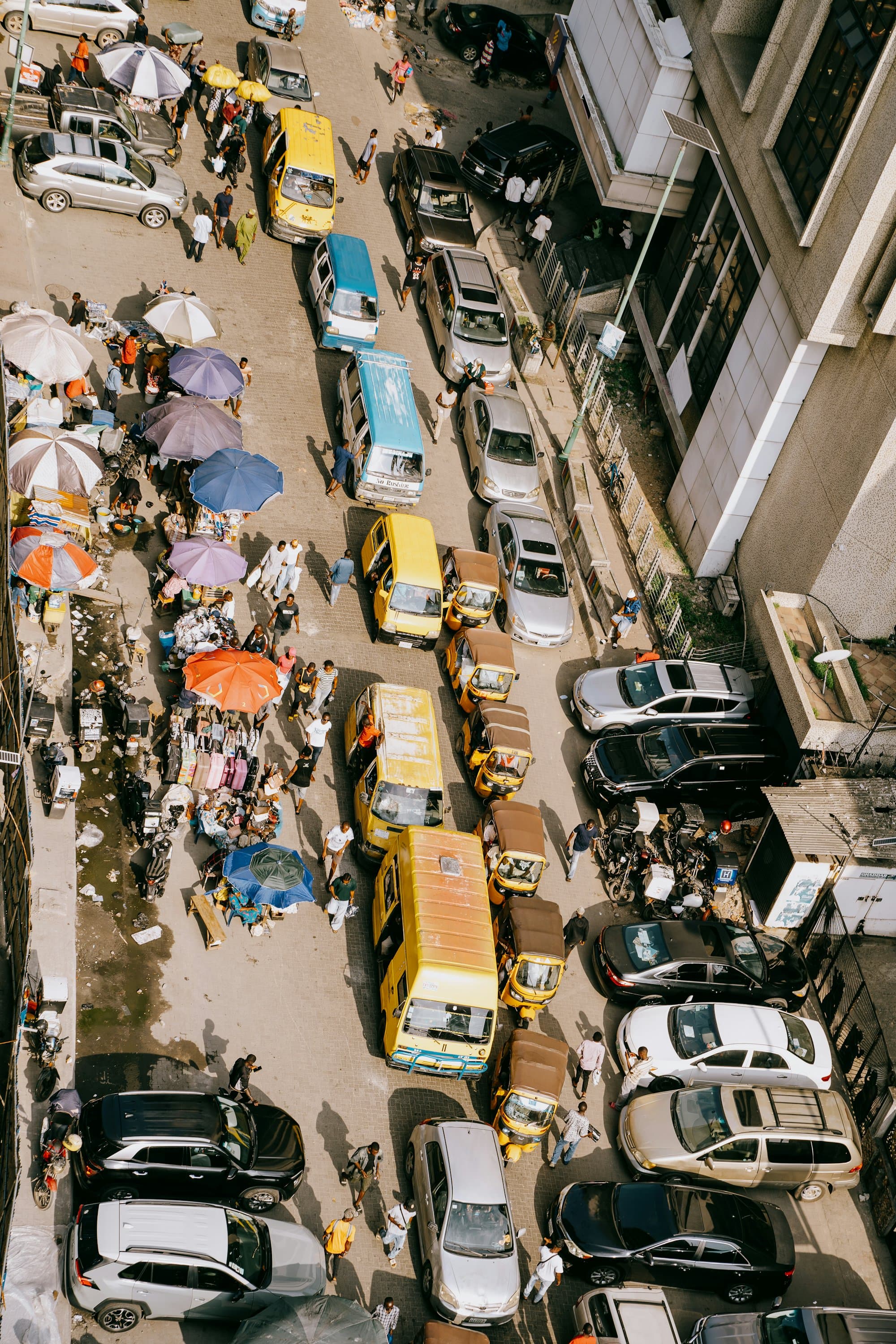
PHOTOS.hero
Home and About page headers, under a light frosted layer

PHOTOS.owner
Why Mercury section
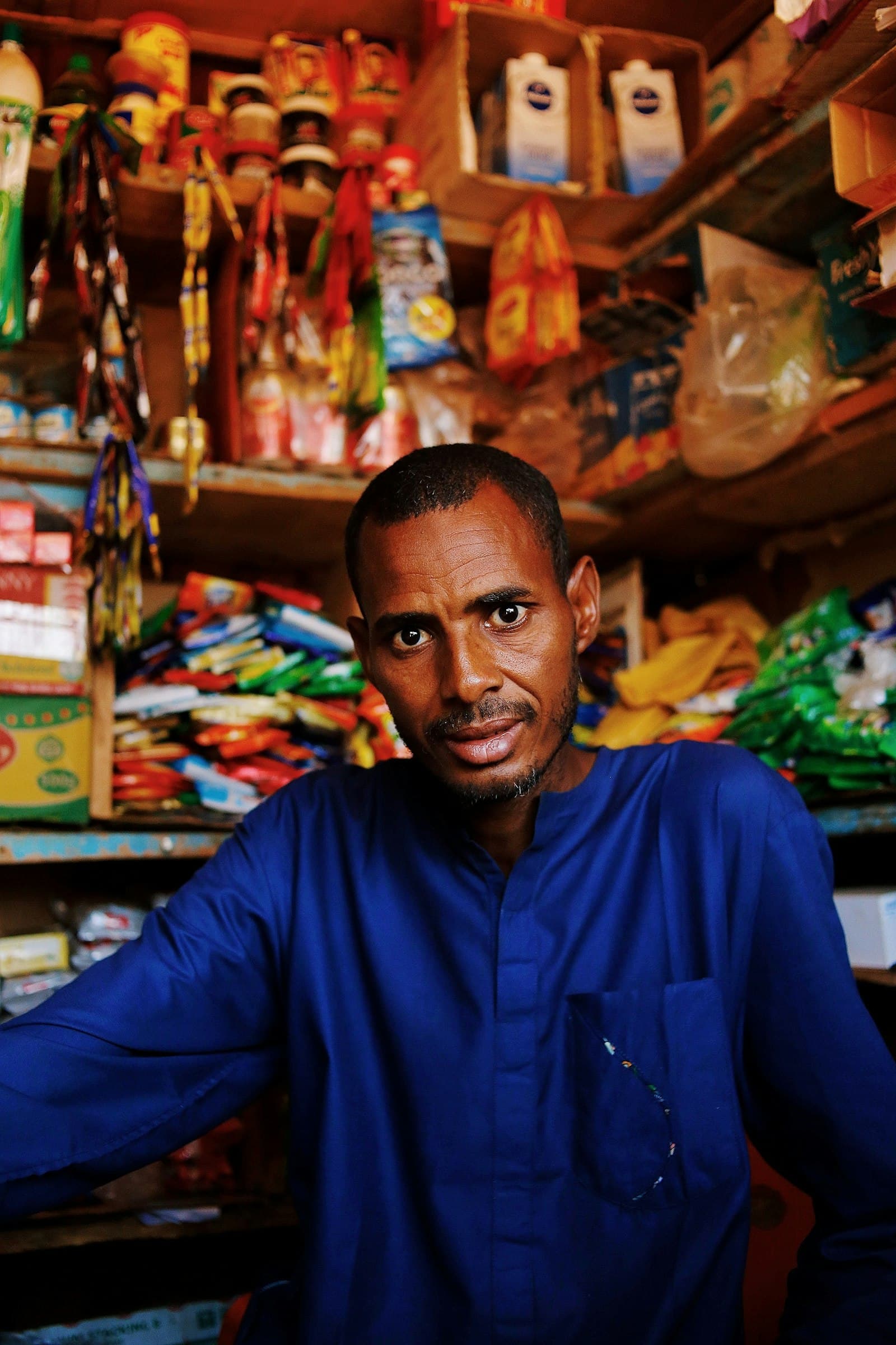
PHOTOS.stores
Stores feature row, About story
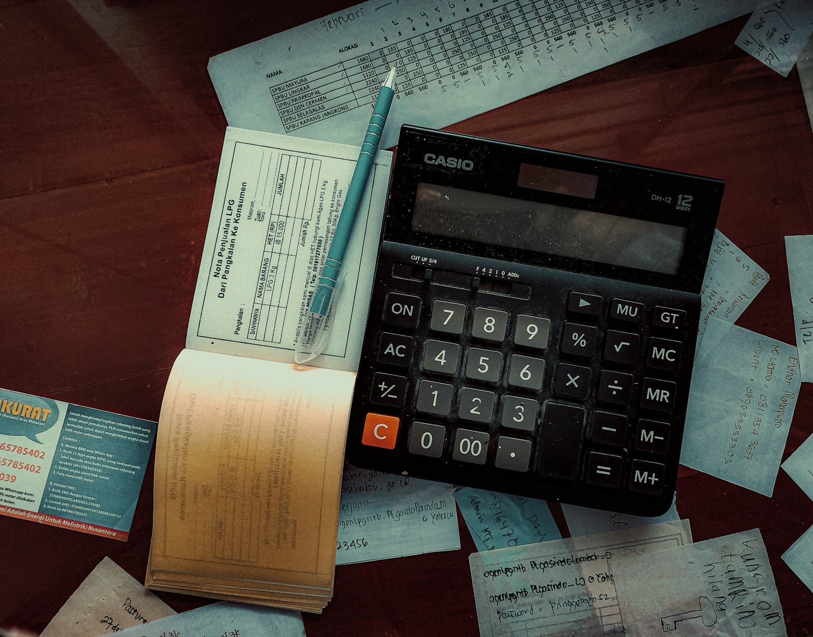
PHOTOS.accounts
Accounts feature row
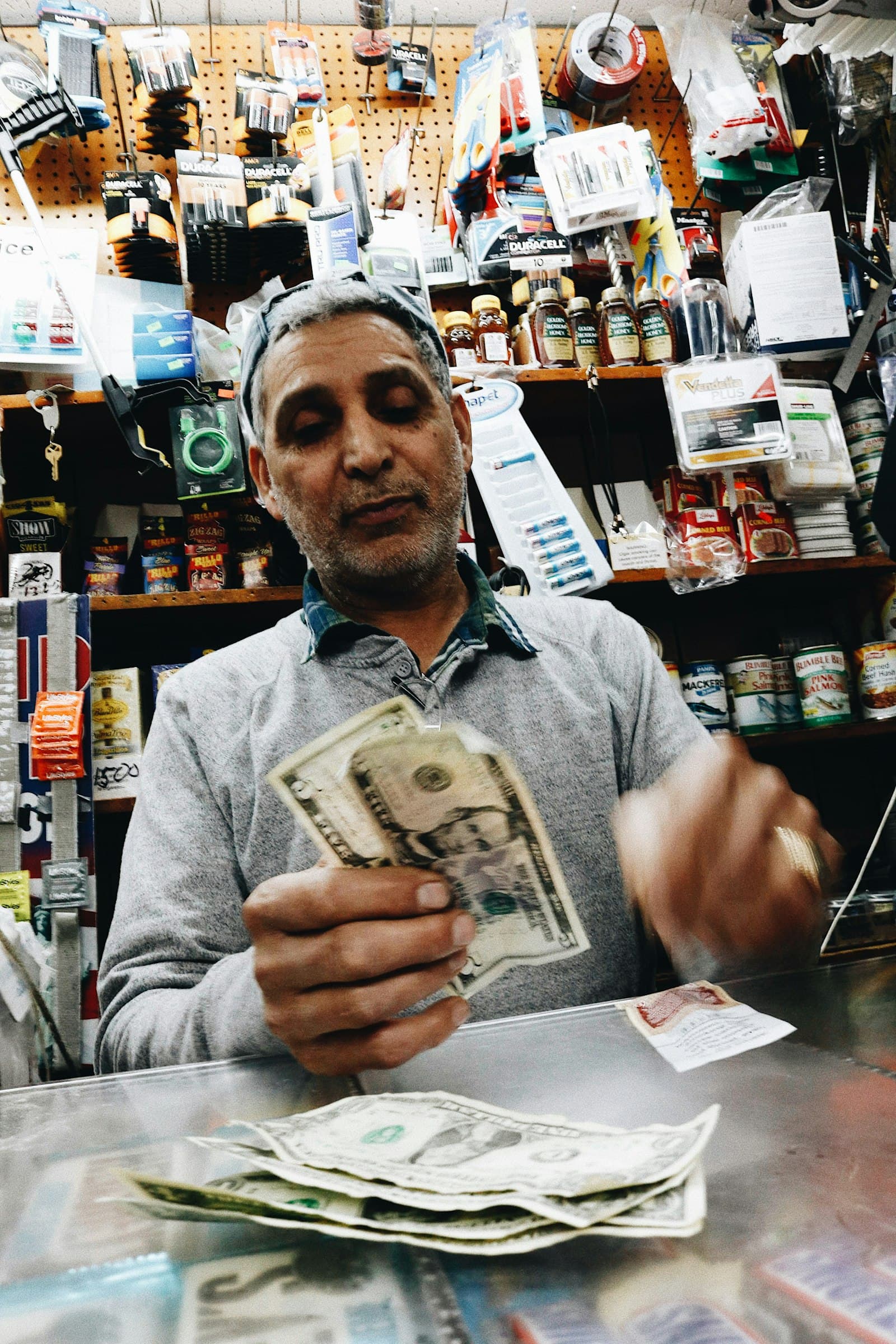
PHOTOS.reconcile
Reconciliation feature row
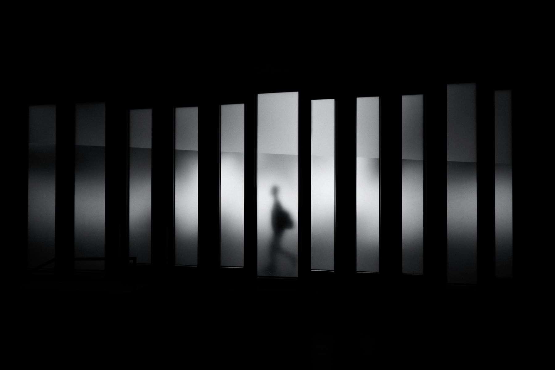
PHOTOS.glass
Closing call to action
Rules
App screens belong only in the Screens section; everywhere else use photography.
- Prefer people, counters, shelves and streets over abstract shapes.
- Keep text legible: add a frosted layer and a soft text shadow over busy photos.
- Hero and page headers slide under the glass header with -mt-16.
Line illustrations
Drawn from flat shapes on an isometric plane (components/illustrations). They take their hue from CSS variables.
Logo and icons
A bead of mercury cut on the diagonal, the halves slid apart. Flat, one colour, no effects.
Mark
LogoMark uses currentColor. Files: public/brand/mercury-mark-black.svg and mercury-mark-white.svg; favicon is app/icon.svg.
Do not
Keep it flat and unembellished.
- Do not stretch, rotate, outline or add shadows or gradients.
- Do not recolour it with an accent; use foreground or white.
- Do not place it on a busy photo without a frosted layer.
Icons
lucide-react, 16 to 20px, stroke 1.75 to 2. Import single icons; do not add another icon set.
- StoreStores
- WalletAccounts
- CheckCheckReconciliation
- CheckCheck lists, success
- ArrowRightPrimary call to action
- PlusFAQ closed
- MinusFAQ open
- HardHatUnder construction
- HammerUnder construction
- ConstructionUnder construction
- LoaderCircleBuilding, loading